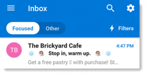
“6 billion emoticons are sent on a regular basis.”
Emojis are undoubtedly an integral part of communication when it comes to digital mediums. So much so, that the ‘face with tears of joy’ emoji was once declared to be the Oxford Word of the Year.
The reason for its popularity is the efficiency with which emojis can communicate the message or an emotion. And this popularity has inspired brands to integrate them into their marketing campaigns.
THE IMPORTANCE OF EMOJIS IN DIGITAL MARKETING
“Do you know using emoji in a tweet can increase your engagement by 25%, as compared to the tweets without one?”
Emojis have now found a place in almost all forms of online communication. Be it to capture the attention of your audience for the latest trends or following a traditional tone in marketing, emojis have always found a place in all social conversations.
Here are some reasons that establish the importance of emojis in digital marketing –
1. Humanizes the brand
A messaging that contains emojis brings out an added brand personality and makes your content more relatable. Moreover, since digital communication lacks face-to-face interaction, there is room for misinterpretation. Relevant emojis can make your brand speak in the language of the target audience, thus making you one of them.
According to research, “using emojis in Facebook posts can increase likes by 57% and shares by 37%.” This is enough proof that emojis do play a vital role in reinforcing the meaning of your messaging.
Tip: It is always advisable to use only those emojis that are compatible with the devices of your target audience. If they see just question marks or boxes in place of the emoji, the purpose remains unfulfilled.
2. Boosts engagement with the audience
Statistics say that “using emojis can increase engagement by 48% on Instagram. Moreover, posts with emojis have 2.21% interaction rate while the ones without have only 1.77%.”
Posts with emojis always have a friendlier tone, as they are mostly related to a positive emotion. Using emojis in your communication will make your audience happy, thus encouraging them to engage with the content. Moreover, the human brain can process images way faster than text.
Studies have shown that while seeing emojis, the brain functions in the same manner as seeing real human faces. This is another important reason why user engagement with emojis is much higher than simple texts.
Push notifications with emojis are likely to have 85% more open rate and 9% conversions than just text notifications. Be it any channel, the right emojis can keep your audience entertained and engaged with your brand.
3. Adds context to the content
Have you ever noticed how a simple exclamation mark has the ability to change the tone of your communication? Emojis also have the power to convey your brand’s emotions in a way that simple text can’t at times. However, it does not mean that emojis can replace good quality content, but the combination of the two can help achieve the desired results faster.
Conveying your message on social channels that provide limited character count like Twitter becomes easier with emojis. Using them can add extra context and emotion to your content.
THE EFFECTIVE USE OF EMOJIS IN DIGITAL MARKETING
The first step in using emojis effectively is to understand the target audience and accordingly strategizing the use of emojis. Demographics play a crucial role in determining the kinds of emojis and how much and when you should use them in your communication.
Different devices have their individual emoji display styles, and so it is also important to test on all devices and platforms so that your message is communicated everywhere as you wanted it to be.
Paid Advertising
Using emojis in ads can also improve the chances of engagement. An example is of Adespresso who has created two similar ads, but only one of them had an emoji at the beginning of the headline. An A/B testing revealed that the ad with the emoji had a 241% higher click-through rate than the ad without the emoji.
Social Media
Emojis can be used on social media as post updates to lay more emphasis on the content. It can also be used for engagement, for example asking a question to your followers and asking them to reply only with emojis or encouraging them to share their current mood with emojis.
Facebook has its own set of emojis that makes it easier to integrate them into your posts and communication.
Email marketing
“An email subject line with an emoji can increase the open rate by 29% and click-through rate by 28%.”
The inclusion of emojis in email marketing can make a positive impact on both engagement and open rates. However, use emojis for emphasis instead of replacing any content with them. This is because in case the emoji is not supported, the content can lose meaning.
Make sure to test the emails on various browsers and providers before sending out to your subscribers.
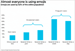
92% of people on the Internet use emojis on a regular basis and it has now become a language in itself. Have a proper understanding of your audience and the emojis that you use in your marketing strategy to get the best results for your business. If you wish to know more about the use of emojis in social media marketing, leave us a message and we’ll get back to you!
“Websites promote you 24/7, no employee will do that.”
Most consumers search online for information that will help them make smarter purchasing decisions. In fact, according to the eCommerce Foundation, 88% of consumers will research product information before they make a purchase online or at a physical store. This buying behaviour trend emphasizes the importance of a website for today’s businesses.
97% of consumers search for brands and services online. A website helps a brand to build its credibility. Without a website, customers will keep wondering what the business or brand is about and eventually may opt-out or work with other brands whose intentions are clearer. Websites are one of the most important marketing tools that can serve and retain a brand’s current customers as well as be influential in finding new customers.
A brand without a website can lose out on important opportunities in business. However, just having a website does not mean the job is done. In a survey by HubSpot, 76% of the respondents indicated that the most important element for them while visiting a website is whether “the website makes it easy for me to find what I want.”
UI/UX DESIGN TIPS FOR OPTIMIZING A WEBSITE
UI (user interface) and UX (user experience) largely focus on customer satisfaction which is an important contributor to the success of any agency, organisation or business. Today the most successful websites and applications are those that boast of easy responsiveness and efficiency. Fast navigation features and ease of understanding drive more user satisfaction thereby leading to happy customers which help boost revenue in the long run. A proper website experience raises the confidence level of the customers in the brand which in turn helps in business growth.
Following are some important UI/UX design tips for website optimization –
Simplicity is key
When a visitor comes to a website, they are either looking for some specific information or to complete a particular action. Hence adding design elements which are unnecessary and serve no functional purpose makes it difficult to navigate a website. From the user’s perspective of experience and usability, a website should be simple.
For instance, brand colours that are chosen for designing a website should go with the theme of the brand and should be part of the same colour palette. The typefaces that a brand opts for should be a maximum of 3 and in different sizes. Graphics should be incorporated into a website design only if it helps a user to complete their intention of visiting the website.
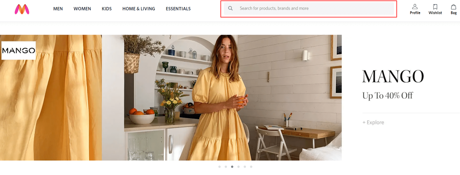
Navigability and search bar
People visiting a website should be able to reach it easily and not have to think much about what to click next. Instinctual navigation on a website is extremely important to ensure that visitors can find what they are searching for.
Hence, it is crucial to keep the primary navigation structure simple and easily understandable. Navigation on the footer of the page is helpful. Use of breadcrumbs on all the pages of the website along with the homepage is advisable as it will keep the visitors aware of their search trail.
Add a “search” bar on the top portion of the page so that it is easy for people to look for products or services. Also, include links within the page copy and clearly show where those links lead to.
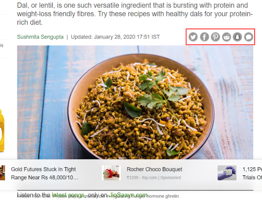
Social Media Share Buttons
The impact of content lessens if the visitors of a website do not have the freedom to share it. Social share buttons are small buttons that are clickable and placed at the top, bottom or at the sidebar of web pages. These buttons portray the icons of different social media sites like Facebook, Twitter, LinkedIn, Instagram etc. which allow a visitor to share a page of their choice directly on their social media channels. A website without these buttons tends to lose a large amount of traffic from social media that is generated from the visitors reading the content, blogs or performing any other action.
Call-to-actions
Call-to-Action buttons help or direct a user in taking the next step on the page. Brands should incorporate proper call-to-action buttons that lead visitors to content that educates them and assists them in solving their issues. Some useful call-to-actions are “click here”, “watch video”, “sign up for a webinar”, “buy now” etc.
Mobile-friendly
As per research, “80% of internet users own a smartphone and according to Google “61% of users are unlikely to return to a mobile site they had trouble accessing and 40% will visit a competitor’s site instead”.
A website should be optimized for different devices like mobile phones, tablets as well as operating systems and web browsers to enable ease of use and to provide a better and improved user experience. Therefore, this indicates that the design of the website should be responsive and flexible.
Brands can add alt-text to the images which will help visitors on the page understand the content even without being able to view the images. Cohere to platform-specific design conventions instead of stuffing in random elements that might not go well with the particular platform.
TIPS TO MAKE WEBSITE NAVIGATION EASIER
Establishing easy-to-follow directions through planned website navigation will help a brand’s customers explore their site effortlessly. Good website design and experience is not only about having useful and genuine information but also presenting it in an organized and appealing way. It is important to keep a tab on your website and make improvements from time to time for better user experience.
Keep in mind the following tips to make website navigation easier for visitors –
Use of clear and simple headings
“On average, 8 out of 10 people will read the headline, but only 2 out of 10 will read the rest.”
The first thing that a user notices when they visit a brand’s page is the ‘heading’, so brands should be able to live up to the expectations and not afford to make mistakes in that. Brands should ensure that all their headings and subheads are clear and straightforward. It is also aesthetically better to keep all headings in the same length and parallel structure. Proper headings and subheads are also important for better SEO and website navigation.
When the headings and subheads are crisp, clear, understandable and directly address the questions that the visitors come looking for to a brand’s website, it makes the site easier and more comfortable to navigate.
Addition of relevant images
Images are a great way to make a website look more appealing, interesting and attractive but only when they are relevant and chosen carefully. Using stock photos for a website is a big mistake in this regard committed by brands. Although it is easy and a cheaper option to use stock photos and may also look professional, it is often perceived to be impersonal, uninteresting and unrelatable by the audience.
The human brain is known to identify images in almost 100 milliseconds. Therefore, selecting images that are an ideal reflection of a brand’s product or services can be a great opportunity to attract the audience even if they skip reading the content on the website.
Interactive website
An interactive website is most likely to make users browse your website for a longer period of time and encourage them to keep coming back. To make that possible, brands can make the text and images on the website interactive, engaging or may add some detailed textual information about a particular product or service. Other creative options for an interactive website include embedding polls and quizzes on the site.
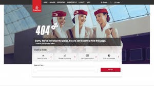
Interesting 404’s
If a visitor encounters a 404 error on a website, it can have a negative effect on that particular site which may drive users away. However, there might be unavoidable times when this issue can crop up, so the best thing a brand can do is be prepared for it.
Brands should keep a thorough check on their website pages on a regular basis so that they are able to find the errors before their users find it. Apart from that, brands can also customize error pages to make it friendly, attractive or humorous instead of a general page. Another interesting way to keep the page audience entertained instead of annoyed is by integrating some kind of games in the 404 error pages.
Choice of content
For a brand, if the content on their website is dull, monotonous, difficult to grasp or unnecessary, the audience is more likely to skip the page without reading anything. Style and tone are very important in writing, and so is the formatting and visual appeal. Brands should publish relevant, engaging and interesting content in short paragraphs, break it up into sub-heads and bullet points instead of long paragraphs.
OFF-PAGE SEO STRATEGIES FOR WEBSITE OPTIMISATION
One very important technique which helps generate traffic to a website is search engine optimization. This can be done by obtaining a high-ranking placement on the first page of the Google search engine or other Search Engine Result Page (SERP) like Bing, Yahoo etc.
A few well-known off-page SEO strategies for website optimization are –
Guest blogging
Guest posting means posting an article that is written as a guest post by another website webmaster and is considered to be a popular link building method. There are plenty of such quality blogging sites where they allow authors to post articles as a guest. The author incorporates or inserts the links of another article in the guest post which creates a backlink to the author’s website. However, multiple postings on the same guest blogging site should be largely avoided.
Image submission
For better optimisation, brands should often share photos on popular image submission websites to increase visibility. These images should be optimized properly with the right URL and title tag. For visitors to understand the context easily, the images should also have a proper title, description and tags. Some popular image submission sites are Pinterest, visually, flickr.com, tumblr.com, imgur.com, picasa.google.com and mediafire.com.
Google My Business
Brands can utilise this free platform to optimize and gain the best local SEO ranking. It helps manage online presence across Google, including search and maps. Some of the basic things that should be followed while using this technique are:
- Keep the description within 250 characters
- Make sure that there is one primary owner for every listing
- Keep a thorough tab on the reviews and be ready with quick replies
- Publish real images in the relevant category
- Update galleries, posts, products or offers on a regular basis
Web 2.0
Here, a brand can create sub-domains on high domain authority websites like Medium.com, Tumblr, WordPress, Blogger and Weebly. By incorporating Web 2.0, brands can create more link building and increase website rankings. These websites have high page rankings and domain authority, by default. If done the right way, this method works great for building links. One of the biggest advantages of using Web 2.0 technique is that brands will have complete control over handling the links. With this authority, brands will be able to change links, modify anchor texts and also add or delete backlinks.
Directory submission
High PR directory websites provide dofollow links which brands may utilise in order to get valid and quality backlinks. Listing websites on directories is a part of SEO that helps to get powerful backlinks to a website. It is very important to list websites in the correct categories with proper title and description. Some popular directory submission sites are boingboing.net, thewebdirectory.org, dmoz.org, einternetindex.com and elecdir.com.
COMMON MISTAKE THAT SHOULD BE AVOIDED DURING WEB DESIGN
When it comes to developing a website which boosts conversions and generates revenue, several business houses continue to struggle. A brand’s website needs to be appealing, but it also needs to generate money. Designing a website is not only about changing the aesthetics, but it also involves a lot of other aspects. No matter how creatively it is designed- if the audience fails to find a website on Google’s search engine or has difficulty in navigation, it’s a loss for that brand. Therefore, brands need to look into SEO, typography, designing, content, usability, navigation, graphics, performance and more while designing a website. If these aspects are not glorified then they can later adversely have an impact on the website.
Here are some common mistakes that should be avoided while designing a website –
Non responsive design
“40% of users will visit a competitor’s website after a poor mobile experience.”
Google prefers mobile-optimized sites and therefore, having a responsive website design is one of the best ways to deliver a great browsing experience to users. Most consumers browse on their smartphones, iPads or tablets at a rate much higher than they use desktop. A responsive design makes a brand’s website accessible to the users regardless of the device they are using. It enables the URL of the website to be the same across every device with the same HTML code. This configuration helps Google to crawl through pages and retrieve content easily. Hence, Google recommends brands to optimise their website for mobile, tablets, desktops and other devices.
Poor quality of content
“Content is king”- Bill gates
A stale and boring website will not be able to build a strong relationship with potential or repeat customers. Brands need to offer unique, informative and fresh content to their audience. Frequent sharing of relevant and quality content is now highly valued as an SEO practice. Publishing blogs on the website will allow a brand to share content about industry trends, products, services and helpful expertise.
A brand’s potential customers need value which, in turn, will help gain their trust and build the brand. Choose topics that provide useful, relevant information and keep the readers engaged and present it in a well-written format. Along with writing content, the infusion of the right keywords in a natural way is also very important. Brands need to identify the keywords that users are more likely to use and include them in the relevant pages.
Slow load times
According to Google, 70% of the websites they surveyed in their study took seven seconds or longer to load.” A web page or website that takes more than 3-4 seconds to load completely is considered to be slow. Slower the site, larger is the bounce rate. It may also significantly affect a brand’s search engine rankings. Therefore the accepted best-practice by Google is the load time of 3 secs for brands who wish to keep visitors on their website.
Selection of unclear fonts
Cursive fonts, hand-drawn scripts and symbols can be difficult to read for the visitors. Fonts that are unreadable or difficult to read decrease cognitive fluency. Cognitive fluency refers to the ease of use for the visitor. People prefer content that’s easily readable and easy to think about. An unclear font increases cognitive load and decreases understanding.
Absence of favicon
Many website visitors prefer to use lots of tabs while they’re browsing. Some users leave tabs open so that they are able to view them later. Favicon is a small iconic image which represents a brand’s website and is found in the address bar of the web browser. It gives visitors the visual cue they need to orient themselves, saves time while finding which website they are looking for and returns to your tab while browsing.
In today’s age of instant gratification, the most successful websites are the ones that are quick, responsive and efficient. Design and software are now heavily based on user experience because it is mostly about the consumer in business. Even if users are simply browsing, it is up to the brand to make the users navigate through their website in the most efficient way possible so they can get the product or service they need.
It is essential for brands to keep a tab on their website and make improvements from time to time for better user experience. Keeping a record of the above important metrics will help in analysing where the website needs work and accordingly it can be designed. To know more about website design and optimisation, leave us a message and we’ll get back to you.