May 13, 2015
How Important Is Your Logo?
Photocredits: nike.com , wikipmedia , adweek.com
The Nike Swoosh. The Starbucks Siren. The Twitter Bird. The one thing that these three have in common, is the fact that they have become, in a very short span of time, iconic brand logos. They have anchored the company’s brand image and granted it maximum visibility in the marketplace.
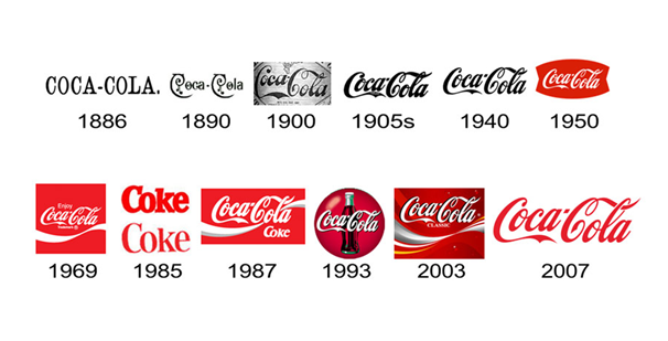
Logos are a critical part of any business. From colour to shape to size, logos play a very important role in defining a company’s culture, and reflecting it to the general public. Over time, certain colours have come to represent specific aspects of a brand. Red, for instance, suggests passion, intensity and aggressiveness. You can see these aspects reflected in the logos of companies such as Red Bull and Levi’s. Blue, on the other hand, represents depth and stability. The best examples of companies representing these qualities would be Samsung and Ford. Logo also evolve over time, to suit the fancies of consumers according to prevailing trends. So, there will be a visible change in the shapes and sizes, too. For example, CocaCola routinely alters the size of its logo. The changes are minimal, but they are definitely there.
The Coca Cola logo has undergone many changes in its years in the industry. Photo credits: www.brandsbyblake.com
Experts suggest that this is an exercise in branding which allows companies to better relate to current trends among consumers, and also to keep with the time. This is where the need to connect a brand and a logo comes into play.
A logo mirrors a company’s character. Brand image speaks volumes in the corporate world. Therefore, a marketing company may prefer a bold logo to come off as active and aggressive, whereas a banking company might prefer a subtle logo to reflect their dependability and solidity. However, the time when mere appearances of logos drew customers is long past. Today, in a world where the number of companies both big and small is ever growing, a company’s logo has to carry a specific meaning. It has to signify something special or unique.
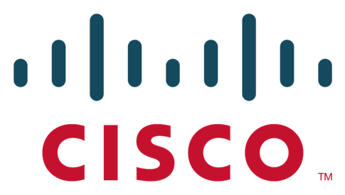
Logos are designed with an intention to convey deeper meanings. Photo credits: wikimedia
A good example of how companies have started attaching deeper meanings to their logos is the Cisco logo. Founded in San Francisco (that explains the brand name), the series of blue lines in the logo represents an electromagnet, while also symbolising the Golden Gate Bridge in San Francisco. Popular ice cream chain Baskin Robbins is another example. The chain offers a variety of 31 flavours, therefore the number ‘31’ has been incorporated within the ‘B’ and ‘R’ initials in the brand’s logo.
The brand’s logo also plays an important role when it comes to a company’s social media marketing. In recent years, Facebook and Twitter ads have come a long way. Marketers have jettisoned generic advertisements that are text-heavy, opting instead for engaging ad creatives which speak volumes through minimalism. When such a trend is prevailing in the ad market, companies need to understand the importance of logo placement. To proudly splash the logo all over a viewer’s News Feed is no longer attention grabbing; it is considered irksome. Logos now occupy a very small space on ad creatives. Most companies follow a simple practice of placing their logos on the top right hand side corner of the creative. This puts the logo in a visually dominant position, while still showcasing the ad in its entirety. While there is no universal size that companies have to follow, most stick to an unspoken rule of placing the logo within 1 ½ of the top corner or sometimes, bottom. Consistency plays a huge role. Most brands adhere to their own size and side specifications when it comes to marketing collateral.
For a lot of people, the logos of companies like Nike and Starbucks immediately establish a firm connection to the company’s business, without having to see its name. This instant recognition comes from creative logo design, and its memorability. A logo alone may not take a company places, but it certainly helps put it on the business map, for it is possibly the most visible part of the business and the company itself.


