October 12, 2018
6 Tips To Make Your Website Easier To Navigate
“Websites promote you 24/7, no employee will do that.”
In today’s time, a brand without a website means only one thing - losing out on great opportunities in business. However, just having a website does not mean the job is done. In a survey by HubSpot, 76% of the respondents indicated the most important element for them while visiting a website is when “the website makes it easy for me to find what I want.”
Establishing easy-to-follow directions through planned website navigation will help your customers explore your site effortlessly. Here are 6 tips to make your website easier to navigate -
 When the headings and sub heads are clear and directly address the questions that the audience come looking for in your website, it makes your site easier and more comfortable for navigation.

 “70% of people look at lists with bullet points while 55% look at lists without bullet points.”
Different content formats, even on the same webpage enhance the visual texture and will help grab the attention of the audience.
 Source: Woobox[/caption]
 Source: Zomato[/caption]
A mobile-friendly website also has other advantages like improved user experience, search visibility, brand identity and even lead generation.
 Source: creativebloq.com[/caption]
Remember that a good website design and experience is not only about having useful and genuine information, but also presenting it in an organized and appealing way. It is important to keep a tab on your website and make improvements from time to time for better user experience. To know more about how to make navigation easy on your website, leave us a message and we’ll get back to you soon!
1. Ensure you have your headings right
“On average, 8 out of 10 people will read the headline, but only 2 out of 10 will read the rest.” The first thing that a user will notice when he/she visits your page is the heading, so you cannot afford to go wrong there. Make sure that all your headings and subheads are clear and straightforward. It is also aesthetically better to keep all headings in the same length and parallel structure. Proper headings and sub heads are also important for SEO services. When the headings and sub heads are clear and directly address the questions that the audience come looking for in your website, it makes your site easier and more comfortable for navigation.
2. Add relevant and original images
“It has been estimated that 84% of communications will be visual by the end of 2018.” Images are a great way to make your website look more appealing, but only when chosen carefully. A big mistake in this regard is to use stock photos for your website. Though it is easy and a cheaper option to use stock photos and may also look professional, it is often perceived to be impersonal, uninteresting and unrelatable by the audience. The human brain is known to identify images in almost 100 milliseconds. Therefore, selecting images that are an ideal reflection of your brand’s product or services can be a great opportunity to attract the audience even if they do not read a single word on the website.
3. Pay attention to your content format
If the content on your website looks dull or monotonous, people are more likely to skip the page without reading anything. Just like the style and tone is important in writing, so is the formatting and visual appeal. Instead of publishing your content in long paragraphs, break it up into sub heads, shorter paragraphs and bullet points. “70% of people look at lists with bullet points while 55% look at lists without bullet points.”
Different content formats, even on the same webpage enhance the visual texture and will help grab the attention of the audience.
4. Make your website interactive
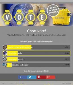
An interactive site is most likely to make users browse your website for a longer time and encourage them to keep coming back. There are different ways to do that - one can be to make the text and images interactive when an user hovers the mouse over it or maybe detailed text information over a certain product or service. Other creative options for an interactive website include embedding polls and quizzes on the website. [caption id="attachment_9969" align="alignnone" width="500"] Source: Woobox[/caption]
5. Your site should be mobile optimized
“67% of shoppers are more likely to buy from a website that is compatible with mobile devices.” The algorithm update by Google in 2018 focuses on mobile-first index. This means that the search engine will primarily look at mobile content for search engine ranking. Hence, if you want your business to stay on top of the search results and people to keep coming back to your page, your website should be easily viewable and readable on all compatible mobile devices. [caption id="attachment_9970" align="alignnone" width="500"] Source: Zomato[/caption]
A mobile-friendly website also has other advantages like improved user experience, search visibility, brand identity and even lead generation.
6. Make your 404s interesting
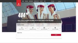
A 404 error can have a negative effect on your website, driving users away. However, there will be times when this issue can crop up, so the best thing you can do is be prepared for it. Keep checking your page from time to time so that you find the errors before your users find it. Apart from that, instead of keeping your error pages general, customize them to make it friendly and attractive (and humorous, if you wish). Another great way to keep your page audience entertained instead of being annoyed is by integrating some kind of games in the 404 error pages. [caption id="attachment_9971" align="alignnone" width="500"] Source: creativebloq.com[/caption]
Remember that a good website design and experience is not only about having useful and genuine information, but also presenting it in an organized and appealing way. It is important to keep a tab on your website and make improvements from time to time for better user experience. To know more about how to make navigation easy on your website, leave us a message and we’ll get back to you soon!


