July 03, 2015
Website Design Trends: Scroll Is In, Sliders Are Out
One of the biggest design myths that needs to be busted right now is that users don’t scroll. Businesses who hire web designers believe that users tire of scrolling (an activity they do with every computer they ever use), and they prefer, instead, to click on sliders (an activity they seldom pursue with any electronic device).
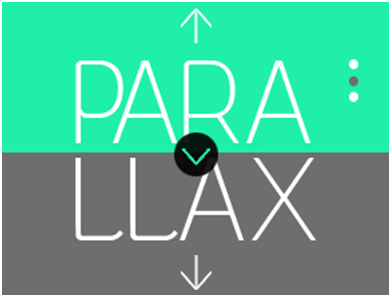
One of the most-loved design trends has been the increasing use of parallax scrolling, a website design technique which arrived on the tech scene as the answer to users’ expectations of a perfect website. What a user wants from a website is entertainment and involvement – and parallax gives them exactly that. What’s not to like about scrolling? There’s the practical advantage of presenting products in a vivid way; there’s the exciting process of storytelling which follows a sequential format that makes it easy for the user to follow; there’s seamless, never-ending engagement when the user hits the bottom of the page and automatically starts at the top again. In fact, users feel more involved with a website when they feel in charge – and scrolling allows them this enjoyment.
Photo credits: www.customedilabs.com
Sliders and carousels on a website, on the other hand, are limited in their ability to entertain the user above a certain limit. Additionally, they are found to spell bad news for a website. For starters, sliders have an adverse effects on conversion rates. They bring appallingly low click-through rates, and are also perceived as annoying by users. Digital media expert James-Royal Lawson says that sliders often get ignored as they are confusing, distracting and squeeze out relevant content. Apart from these golden reasons to avoid using sliders on a website, it would be prudent to make note of the fact that most websites today display content using Flash. This severely affects Search Engine Optimisation as Flash content cannot be crawled by all search engines.
Auto-forwarding sliders are a bad idea. There are always alternatives to get a user’s attention: using a simple scroll with compelling content is definitely the first on that list. With scrolling, you can present your content in interactive ways, and tell vivid stories. It’s also got better feedback. So, do not shy away from putting your users in charge. Remember, the more choices they get with your website, the better your website will perform.


