November 16, 2018
6 Principles of Creating a Landing Page for Higher Conversion Rates
“Generating leads and conversions is the top marketing challenge for 63% companies.”
Landing pages are undoubtedly the primary way of converting an audience to a lead. Moreover, since it’s on a digital medium, marketers have access to a lot of relevant data like forms, load times or buyer behavior for performance review and optimization. The main objective for a landing page is to provide better experiences, as that will lead to better conversions.
Proper targeting and testing can increase conversion rates up to 300%. In order to achieve that, it is important to have the landing page created and designed correctly. Take a look at the 6 principles to keep in mind while building a landing page for higher conversion rates -

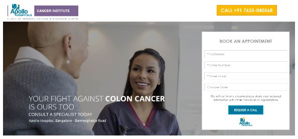 If a user wants to take some action after visiting the landing page (fill a form or make a purchase) and fails to figure how to do it, he/she will probably leave the page without completing the action.
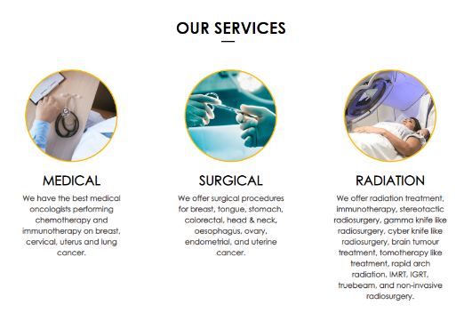 Using videos on landing pages is known to increase conversions by 86%. Including short clips on the page can be really effective.
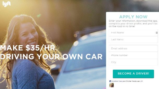 Source: ispionage[/caption]
Given the fact that people are spending more and more time with their smartphones, the landing page form should be mobile-optimized. You have to make certain that filling it with the mobile keyboard is as easy as possible.
 Reading out the copy and CTA button content to someone is a good way to test whether it is easily comprehensible or not. Get feedback from 2 or 3 people and you can also create a few versions of different copies and test to check which works best.
 Source: Mobify[/caption]
While it is true that nobody can exactly predict how the audience will react to your landing page, following these principles will definitely make the job easier. Optimizing content and design based on feedback and regular testings will ensure your landing page gets more visitors and conversions. To know more about UI/UX designs for landing pages, just leave us a message and we’ll get back to you!
1. No distractions at all
The most important job of a landing page is to deliver what has been promised in the displayed ad. The purpose is to bring visitors to your page for conversion and therefore, it has to be ensured that the process is made as smooth as possible, sans distractions. According to sources, 48% of landing pages contain multiple offers - which is NOT a good practice. Remember that the audience is always curious, so if there are multiple offerings on the page, users may wander away from the main form. One page should only have one purpose.
2. Easy to spot CTA buttons
The CTA button of a landing page should be such that it can be recognized easily. A good CTA button has two main aspects - one that it can be easily spotted and two the user knows why he/she is clicking the button and what to expect after that. These two aspects help create a user experience that makes conversions easier. If a user wants to take some action after visiting the landing page (fill a form or make a purchase) and fails to figure how to do it, he/she will probably leave the page without completing the action.
3. A simple design
“You have only 8 seconds to captivate your audience.” In terms of design, the focus should not be on impressing visitors but converting them. Keeping the design simple will help people take the right action. It is also important to mention who you are, what you do & the services you offer. In other words, a brief idea of what the audience can expect if they share their contact information. Using videos on landing pages is known to increase conversions by 86%. Including short clips on the page can be really effective.
4. User-friendly forms
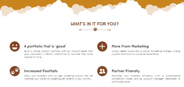
“Your leads are only as good as the information you get from them.” The form is the most valued part of a landing page and of pivotal importance. That’s the place where you collect information from your leads for further interactions. Hence, to increase the completion rate, it is imperative that forms have a user-friendly design. Keep minimum fields in the form and ask only for relevant information. Make sure that it’s not too lengthy and has a clearly visible CTA button at the end. An A/B testing can further help in the process. [caption id="attachment_10489" align="aligncenter" width="610"] Source: ispionage[/caption]
Given the fact that people are spending more and more time with their smartphones, the landing page form should be mobile-optimized. You have to make certain that filling it with the mobile keyboard is as easy as possible.
5. No complicated copy
Jargons are a big no-no when it comes to writing content for a landing page. Heavy sounding words may make you look smart, but if people fail to understand the meaning, it’s ultimately your loss. Stick to simple words with clear explanations to get your message across easily. Reading out the copy and CTA button content to someone is a good way to test whether it is easily comprehensible or not. Get feedback from 2 or 3 people and you can also create a few versions of different copies and test to check which works best.
6. Pay heed to what happens after the landing page
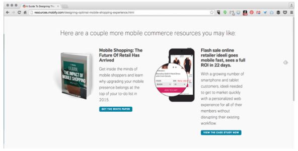
The post-conversion part is often not given much importance in a landing page. However, this is a wrong practice. A thank you page not only looks polite, but it also completes the user experience. Apart from that, it is also an opportunity for further interaction that can make way for a secondary conversion. Offering some brand resource like a blog or a case study on the post-conversion page can be an interesting way to understand how engrossed your leads are in your products/services. Knowing the leads better will enable you to nurture them later efficiently. [caption id="attachment_10488" align="aligncenter" width="592"] Source: Mobify[/caption]
While it is true that nobody can exactly predict how the audience will react to your landing page, following these principles will definitely make the job easier. Optimizing content and design based on feedback and regular testings will ensure your landing page gets more visitors and conversions. To know more about UI/UX designs for landing pages, just leave us a message and we’ll get back to you!