September 03, 2019
5 Highly Effective Web Design Tips Backed by Research
Website design involves the process of developing a website from the initial stages of sitemapping and wireframing to designing the layout, writing content, coding, testing and ultimately its launch.
Website design can have a strong impact on the target audience. “48% of people cited a website’s design as the number one factor in deciding the credibility of a business” and “ 2 out of 3 people prefer reading content on beautifully designed websites’. The right web design is important because it influences conversions, bounce rates, website visits and more.
Below are some important web- design tips for brands to follow:
 The techniques mentioned above can be used to make websites more effective, efficient and user-friendly for visitors as well as to increase the rate of conversion and make the website a success. To know more about web design tips, leave us a comment and we will get back to you!
1. Superior Website Speed
According to research, the speed of a website affects the bounce rate, user satisfaction levels as well as conversions and revenue. If a brand’s website is slow, be it on desktop or on mobile devices, it can affect the overall user experience (UX). With the introduction of Accelerated Mobile Pages or AMP and mobile-first indexing, 65% of digital media time is attributed to mobile devices. They account for nearly 2 of every 3 minutes of time spent online. Therefore, it is necessary for a brand to ensure that users visiting their website are able to navigate with ease in a timely manner. If a website does not load within an expected time-frame, brands may potentially lose visitors and kill conversions. Therefore the design of a website should be such that it does not hamper the load speed.2. Leverage the Fold
Fold in a website refers to the portion of the web page that is visible without further clicking or scrolling. It is the first thing that visitors see when they open a website. According to research, 57% of people spend their time above the fold. Therefore to keep users hooked, brands need to prioritize the content and space of the fold. Here are some tips to leverage the fold:- Use clear, descriptive headlines: Use this space to highlight what you can do for the visitors and also highlight your USPs in the headline. Use brief but persuasive and emotional words that trigger a response.
- Include a CTA button: To increase the conversion rate, add a CTA button that is important, clear and visible.
- Incorporate media: Use images or videos to make staying on the website interesting for the user.

3. Keep the Design Simple
A study by Google reveals that website visitors dislike too many visual complexities. They do not like clutter - but prefer clean, white space. It becomes difficult for people to understand the actual use of a product/service on a complex website and hence the brand fails to communicate its main motive for building the website. Sites that have “high prototypicality” and “low visual complexity” are the ones that are most preferred by visitors. Here are some tips to keep the design simple yet useful:- Remove the sidebar: A single-column design is more convenient for users as it means fewer distractions and brings the focus clearly to the content. Many brands are ditching the idea of inserting a sidebar and maintaining a single column for websites.
- Maintain standard layouts: Users love familiarity and any non-standard designs may startle them. So, it is wise to stick to familiar design layouts, tropes to make the website more user-friendly and relatable.
- Logo at the top left
- A search bar at the top
- Social icons at the bottom
- Mobile responsive design

4. Avoid Carousels, Sliders, Accordions and Tabs
Communication through carousels, tabs, rotating sliders, accordions are usually lost as these are viewed less and the call-to-actions are ignored. Visitors generally prefer scrolling through the entire page rather than clicking through it. As per reports, 76% of website visitors merely scan content and hence are less likely to make any extra clicks to read further content if it does not interest them. At the same time, extremely long scrolls may prove to be exhausting, therefore, putting only the most relevant information on the primary landing page is more effective. Other information can be provided on the inner pages that visitors may or may not choose to explore.5. Use Real Imagery
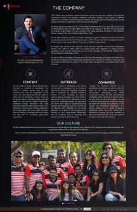
Humans like to connect to people in real-life as well as on the web. Real images are powerful as they indicate authenticity and genuineness as well as correlate with conversions. Use images of genuine customers and avoid stock photos. Original testimonials with the image of the customer are more effective as it instils trust among the audience and encourages them to make a purchase. Apart from that, sharing images of employees also helps in humanizing the brand as they are the face of the company. The techniques mentioned above can be used to make websites more effective, efficient and user-friendly for visitors as well as to increase the rate of conversion and make the website a success. To know more about web design tips, leave us a comment and we will get back to you!