May 11, 2017
5 Rules For Packaging Design That Dive Off The Shelf
For years, brands aimed at making products at the lowest cost while maintaining the competent features. Today, that scenario has changed to making products that not only provide compelling customer experiences and keep costs to a minimum but that also drive loyalty.
Packaging design goes a long way in building products (focusing on features, form and functionality) that create value and generate growth by turning customers into advocates and leading to higher sales.
Everyone knows that packaging is an essential marketing tool that drives customer needs and builds up the brand image of a company. What most people don’t know is that packaging design has the potential to affect loyalty and brand growth as well. Retail packaging design has to talk about the brand, smartly communicate value to the customer and position the brand in the best light possible.
Every year the majority of new products fail. A major reason is that customers don’t have the time or the inclination to spend extra time in weighing a product’s advantages vs disadvantages in a highly competitive market. They use a shortcut to make this decision and the shortcut is product packaging.
Packaging is what draws a customer to a product and helps him/her make a decision. Research states that 60-70% purchase decisions are made in-store. In a supermarket that’s crowded with over 20,000 products all competing to impress customers, packaging design is what helps a brand stand out.
Research says there is a positive correlation between consumer interest and great packaging. There is an almost 30% increase in consumer interest when brands focus on their packaging. According to a study, 52% of online customers showed their interest in re-purchasing a product with premium packaging and around 90% were reported reusing the packaging boxes and bags after purchase.
Below are a few rules you should follow if you want your product to stand out in the market:
1. Clarity and Simplicity
The package should clearly define the product and its brand. The contents, usage, specifications etc should be limited and as direct as possible since customers cannot grasp a lot of information at once. Research says that consumers take an average of 20 seconds to decide whether or not to buy a product and then move on to the next best alternative. Minimal information therefore, can help you win customers.
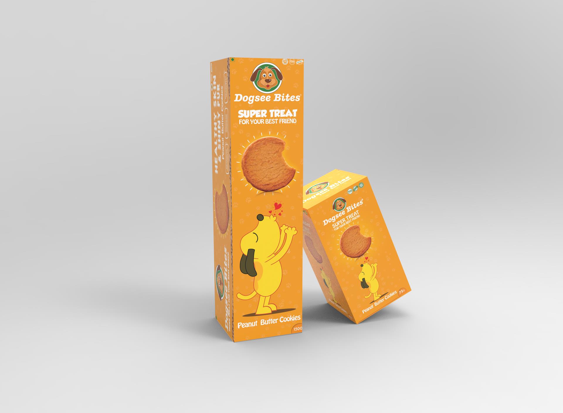
Dogsee Bites is a great example of clear, simple yet distinctive packaging. The cookie on the box clearly indicates what’s inside the box and the dog communicates that it’s a treat for your pet. Information is kept to a minimum so that it’s easy for customers to understand at a glance.
2. Honesty
“Provide what you convey, convey what you can provide”. Today, consumers are able to connect to your brand only if it is real, natural and honest. A misleading brand will not be able to sustain itself in the market for long. Therefore, it is very important to display what’s inside the box so that there is limited post-purchase dissonance.
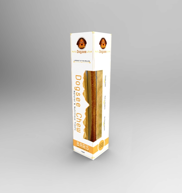
Dogsee Chew’s packaging is a direct example of how packaging can be both innovative and honest. With the clear plastic strip incorporated into the design, customers can clearly see what’s inside the box. The clever use of design to outline the plastic strip in the shape of the Himalayan range indicates that the product is a natural product from the Himalayas.
3. Differentiation
The heart of remarkable brands and packaging design is their originality. Differentiating your brand amongst others in terms of authenticity and originality is important. Using a distinct design style and uncommon visual references makes for a highly differentiated brand.
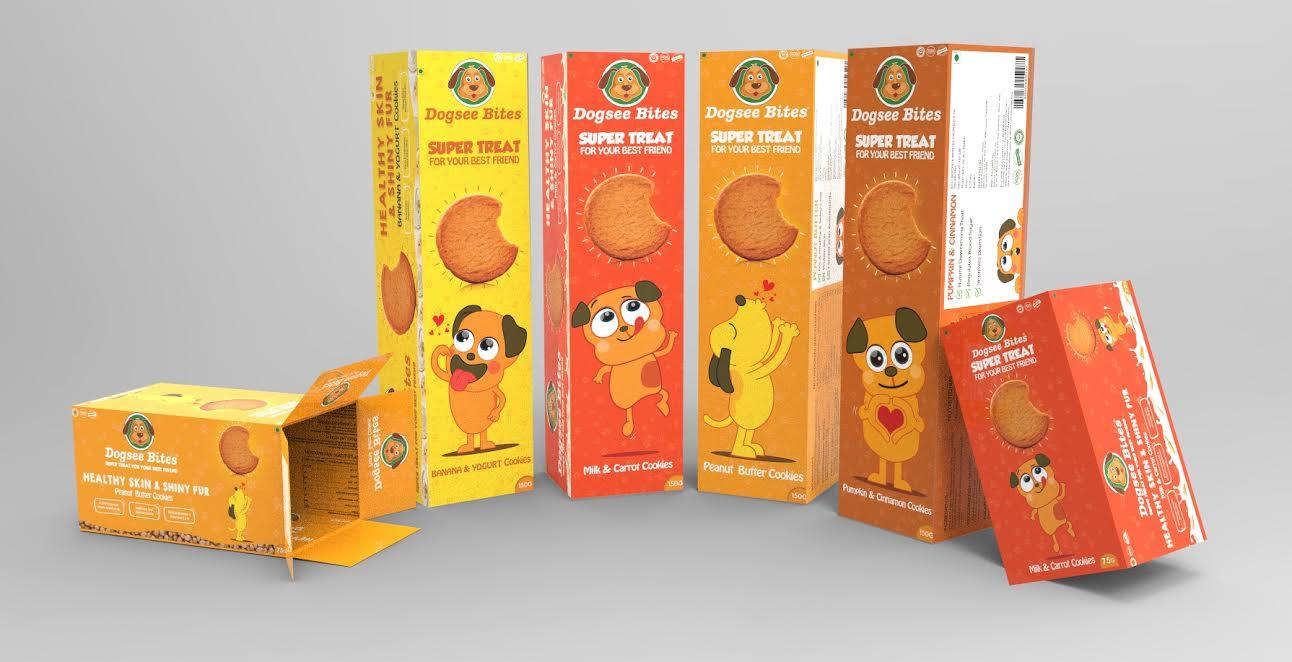
With most dog food brands in the market using real photography to showcase their product- Dogsee Bites stands out in the market by using an illustration design. It uses cartoon dog characters of different breeds to emote feelings of happiness, joy and excitement while connecting with an audience who are looking to pamper their pets.
4. Extensibility
Good packaging design ensures easy variations in the product line, without losing customer interest or visual appeal. It becomes easy to introduce or launch a new product in the same line if modifications in the package design are not challenging. A visually systematic design that promotes accessible changes enhances the visual appeal of a brand and hastens the process of getting a product to the shop floor.
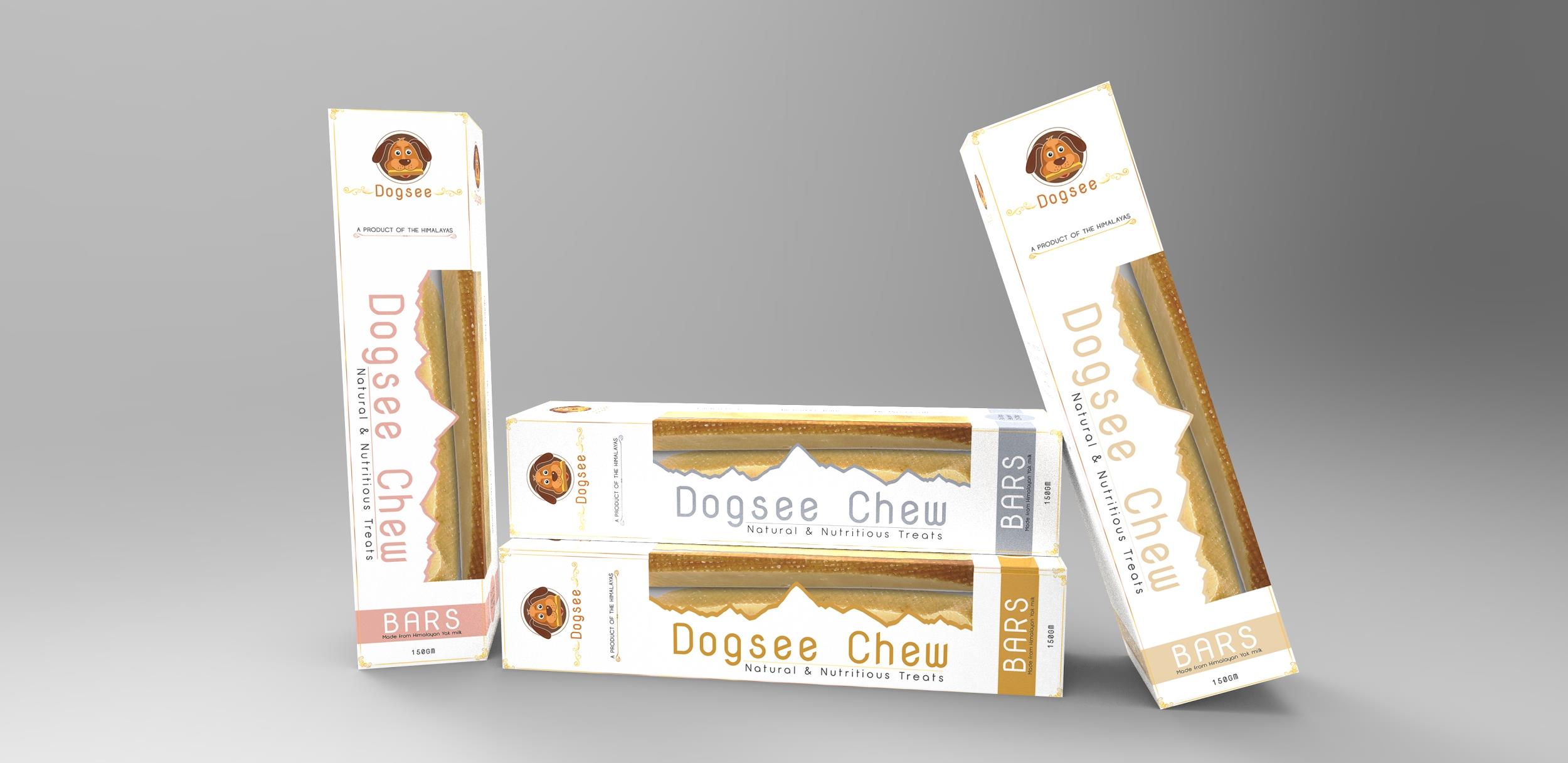
Dogsee Chew uses the same packaging across all variations of its products with a simple colour change in font and band to depict a new product variety. Changing the colour of the band makes for easy recognition in the market and quickens the shopping process for customers. All the brand has to do in terms of packaging each time it comes up with a new variation is change the colour of the font and the corresponding band.
5. Practicality
The functionality and practical use of a product’s packaging is perhaps the most important feature directly linking to sales. Packaging should facilitate usage of a product and provide customers with more reasons and instances to use the product. The more practical a product is in its form, shape or size, the higher will be its usage. The product container should be functional and operational for its users.
Indulekha Oil has extremely innovative packaging that makes application a piece of cake for customers. Equipped with a comb attached to the cap of the bottle, the brand ensures easy application and no wastage without getting the hands dirty.
Keep these rules in mind, next time you’re designing the packaging for your brand. For more details about how we design packaging, visit our design services page.


