March 16, 2015
Tips To Improve Mobile App Onboarding
Every time we open our mobile app store, an array of different apps floods our screen and vies for our attention, all ready to be installed. We install a few and ignore the rest. Even among the few we have installed, there are still some we have opened just once and never returned to. We all have those voiceless apps, simply sitting there and using up a major chunk of our precious phone memory, don’t we?
We all have those voiceless apps, simply sitting there and using up a major chunk of our precious phone memory, don’t we?
The first few minutes that a user installs and launches the app can determine whether they will be coming back or if they’ll immediately scoot and keep searching the app store for something else. If the first experience is an unhappy one, you can be rest assured that your new user is not coming back. Just as you want to make a good first impression, your mobile app too needs it.
The question, therefore is, how do you keep a user engaged after that initial rush of install excitement? Here are few tips we believe would come in handy during the development of mobile apps. to improve mobile app onboarding
1. Easy login and registration process
Logins and registrations are the shaky grounds of an app onboarding process. Analysis has shown that apps lose up to 56% of its users right at this stage.
Why is that so? Some users are more than willing to connect themselves with the app through a detailed registration process, but most others want you to stop interfering and get out of their way as quick as possible. A balance , therefore, needs to be struck between the user experience of onboarding and the friction of necessary steps like login and registration.
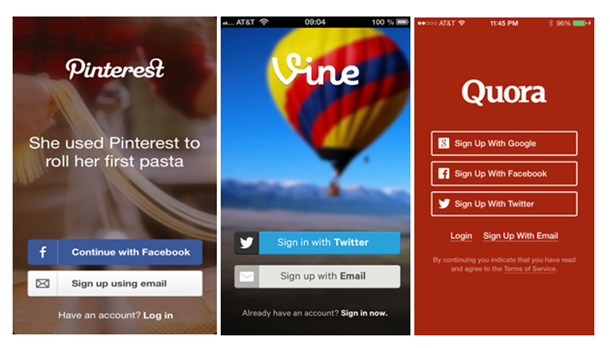
To make things easier for the users, include the social login alongside the email login option. Users could then login through their pre-existing social profiles like Facebook, Twitter, and Google. Top sites like Pinterest, Instagram, Quora and Vine offer Social Login option to their users, giving them a better, more personalized online experience.
According to a technology company and a Social Login provider, Gigya, the top social login preferences of their customers are Facebook(52%) and Google(24%). But as they point out, the right choice for your app depends on your target audience.
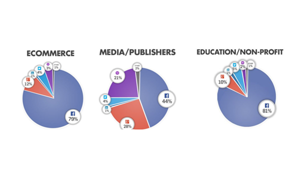 However, if your application requires a lot of information to register an account, have the app only request for the bare minimum (usually the email and password) during registration, and have the user go back later to complete their profile.
2. Show there is light at the end of the tunnel
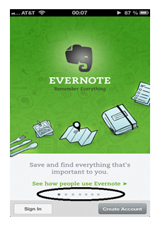
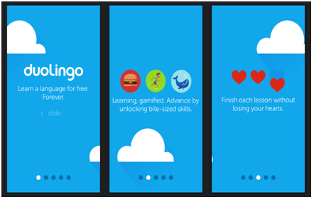
To improve mobile app onboarding, instead of taking the users on a seemingly endless tour of your app, offer them a guided tour. Show them the number of steps remaining and how far they have advanced till then.
This would make the entire process look manageable and easy to the user. If they know the number of steps to be completed, they are most likely to complete the process.
Evernote, Pocket, and Youtube all provide an idea of the number of steps involved in the process for the user to keep a track of his advancement throughout the entire Onboarding process.
3. One slide, one content
Recollect those presentations that grabbed your attention, those from which you retained the most information. The ones that had clear and focused message probably had the greatest impact and were the most memorable. The same applies to mobile apps too. Brief and crisp content make focusing easy and information easier to digest.
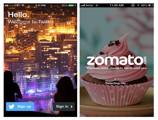
Also, make sure you have attractive visuals for your splash and welcome screens. Eye-catching visuals are an add on to your Onboarding process, especially when your app is anything food related.
4. Tutorials, wherever necessary to improve mobile app onboarding
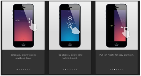
Explain all those functionalities that are essential for the operation of the app( by showing them in an image or by using inline hinting). Never overdo your content. Keep it brief and try to make it fun.
Make it interactive and try to teach them through actions. People learn best by doing, and so you can take the user through some steps in the app where you depict the gestures and actions needed.
Always make sure the user can skip the tutorial because you don’t want your app to come across as pushy. Else the user will drop your app as soon as one drops a pushy boyfriend/girlfriend.
5. Generate early value for the user
First-time users are on the look out for a smooth and engaging app experience, not a truck load of information that would bombard them as soon as they open the app. Avoid this catastrophe and start with a simple, straight forward value proposition. The sooner the user experiences value from the application, the more likely is he to become an active user.
Churn out the core concept of the app and explain it in a handful of screens to create value. There would be future opportunities to deeply engage the audience. Right now what matters in grabbing their attention to your core value.
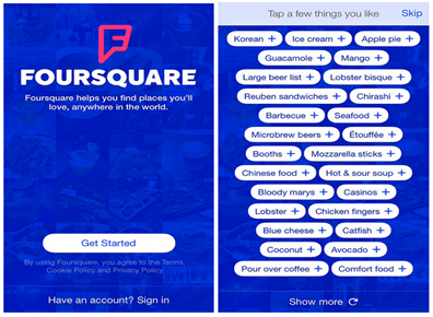
Take a look at Foursquare’s app. The splash screen opens with a “Get Started” Call to Action and goes on to display a list of items, giving the user a fair idea of all that the app has to offer.
This is important, as studies have proved that churn rate is proportional to the distance between sign-up and value.
6. Make it sound human
Let your app talk to the user, just like a friend would do. Plain and simple language is easily relatable and excites the users into interacting with the app.
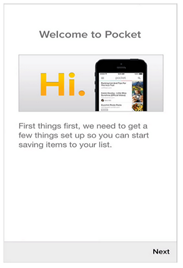
Take a look at Pocket’s mobile app
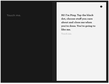
It speaks to you like it is conversing with you. Addressing the user with a ‘Hi’ puts him into a comfort zone and eases him into using the app.
Ping Mobile App
Ping is a network utility used to test the reachability of a host on an Internet
7. Blank Slate, make good use of it
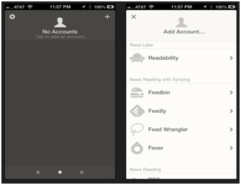
Blank slate, also known as an empty state is the state when the app screen is a blank slate and has no information listed. This is when the app has not been used much and so there is no user specific data to display.
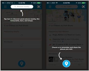
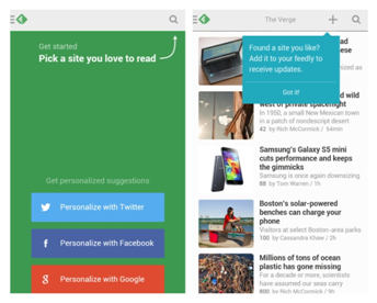
This is the most overlooked feature but plays a major role in a successful Mobile App Onboarding. Make use of blank slates to educate the user on what to expect and give them a call to action. These could be used to provide the user with hints and tips on how to optimize their use of the app.
In the above app, A blank slate is used to not only let the user know what he can do, but also presents a strong call-to-action.
8. Let Onboarding be an ongoing process
Onboarding never ends with the first login. To make sure you have the continued engagement of the user, make sure your onboarding tactics are not let off the hook. Like LinkedIn, as the user continues to use the app, make it interactive and ask questions to add more information to the profile.
The idea here is to keep the user engaged and optimize their use of the app for a satisfying overall experience. What are some of the best Onboarding experiences you have had? Let us know in the comments section below!
