Rebelling

CANDI

Posted on July 5, 2022 by ittisa-admin


CANDI

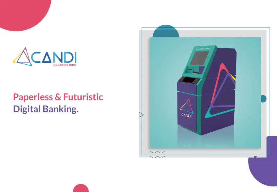
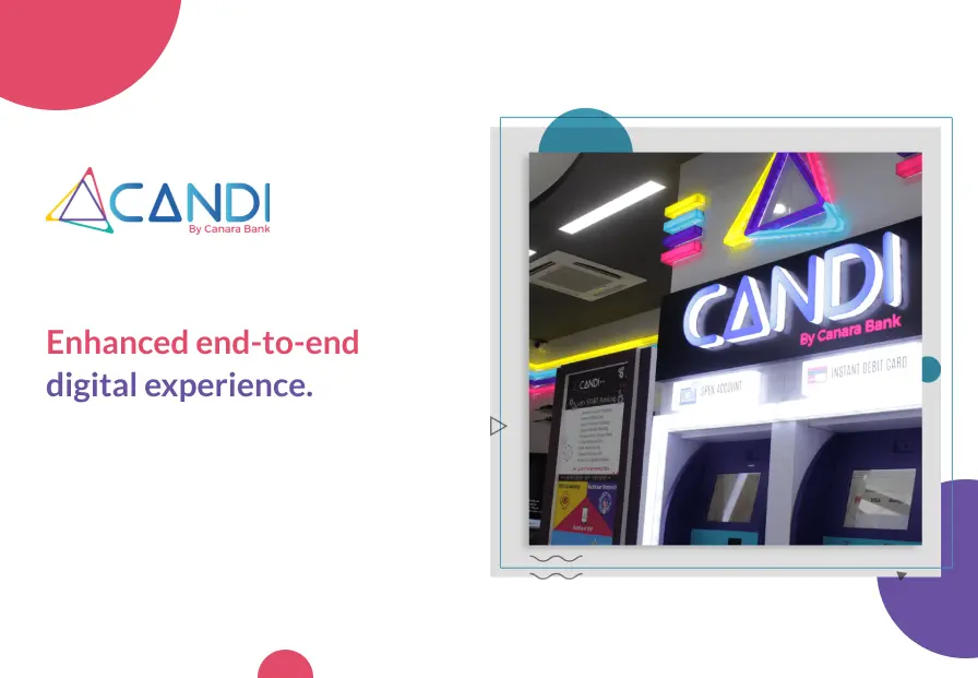
CANDI by Canara Bank is the bank’s first move into paperless, futuristic digital banking. The branch will provide an end-to-end digital experience to customers. The most attractive feature of the Digital Branch is a humanoid robot that addresses basic queries of customers on banking products and services. This is a first-of-its kind initiative by a public sector bank in the country.

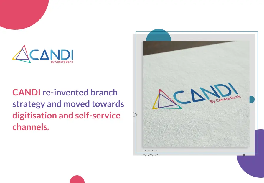
The Challenge: CANDI wanted to re-invented branch strategy and move towards digitisation and self-service channels with an all-rounded branding activity.

The Solution: As a branding and digital marketing agency and for our second PSU win, we conceptualised and designed the brand identity (including the name of the branch and logo) and brand positioning of the digital branch. We also developed the spatial design and flow of user experience. Designing the on-floor customer journey was a major challenge and we were miles outside our comfort zone. But, we drew on our experience of creating stunning customer journeys online and spilled that out on paper for a physical branch. Along with this, we also took on the branding of the self-service kiosks at the branch.

Himalayan Natives

Posted on June 15, 2022 by ittisa-admin


Himalayan Natives

Himalayan Natives is a newly launched organic food brand with the vision to bring 100% natural and wholesome food, sourced from the Himalayas to all. It offers a range of organic cow and yak ghee products that are nutritious, rich in flavour and aroma, and contain no added colours or preservatives.

Our brief for Himalayan Natives was to come up with a packaging concept that brought out the distinctive nature of the products – pure, natural and premium, with emphasis on its Himalayan origin. We came up with various brand building strategies for digital brand development. We developed an aesthetic and expressive design that helped the brand stand out in the highly competitive market by using a soothing colour palette, and sophisticated fonts and motifs. With limited space to play with, we were able to achieve a clear and bold branding, with the USP of the brand cleverly highlighted. The branding is not only eye-catching but also speaks to the customer, invoking feelings of trust and making them reach out for the product.

Dogsee

Posted on June 14, 2022 by ittisa-admin

Dogsee

Dogsee is India’s first organic dog treats company that produces 100% natural and vegetarian treats. After inception, Dogsee quickly gained popularity because of its one-of-a-kind product.

Objective: Increase Brand Recall and Strengthen Positioning through Packaging

Services Offered: Company’s Logo Design, Packaging Design, Print Design, Branding Strategy

Our biggest challenge with Dogsee’s branding and digital marketing branding was to communicate the goodness of the product and its all-natural characteristics without making the packaging look boring and predictable. Being a highly competitive market ruled by a select few, the packaging needed to stand out on shelves and grab attention. We therefore designed different boxes for the different products- the Dogsee Bites were quirky and fun whereas the bars were more premium in look and feel.