October 10, 2018
6 Best Practices for Ecommerce Checkout
“58.6% online shoppers abandon a cart during checkout because of a long and complicated checkout process.”
A majority of ecommerce businesses take special care to optimize the homepage and front end of their website, with beautiful designs and interactive user experiences. However, they often overlook the importance of optimizing the checkout page. For an online store, the checkout surpasses every other page of the website in terms of importance and to increase ecommerce sales.
Studies say that 7 out of 10 shopping carts are abandoned. However, there are multiple ways to improve the checkout experience of your customers and reduce cart abandonment -
 Source: neilpatel.com[/caption]
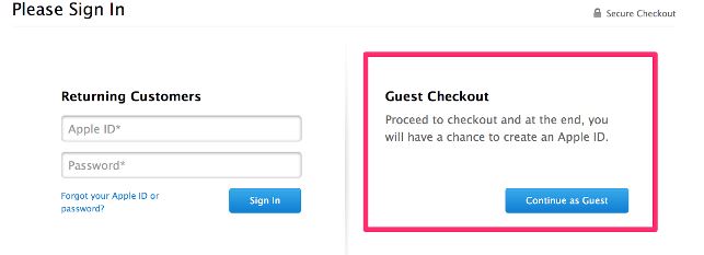
As a business owner, you would definitely want to get customer information for further notifications and offers, but the best practice would be not to force them into it. Keep both the options of registering and guest checkout for customers. You can keep the option of saving the details and creating an account after the checkout process. As an incentive, you can provide a special offer for registering to encourage customers to create an account.
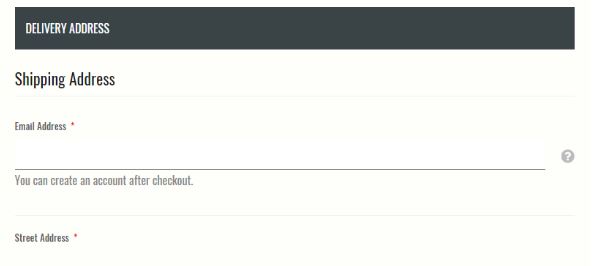 The steps should be few and the process should be fast so that customers reach the order confirmation page as quickly as possible. Also, single checkout pages work better compared to multiple ones.
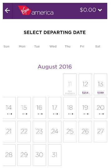 Clicking, instead of typing has always been preferable in the checkout process. This is specially feasible when a customer is making the purchase from a mobile device. It makes the work much lesser, easier and more engaging.
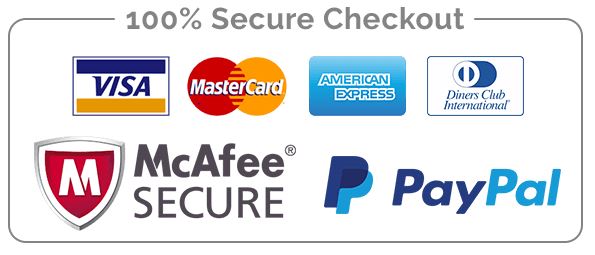 Ensure that there is multi-layered security on your e-commerce platform. Monitor every transaction and keep a lookout for any suspicious activity.
 Source: Web Spiders[/caption]
The checkout page is indeed the most important page of your ecommerce store. A very minor error or distraction can impact your business in a great way. That is why it is all the more important to identify every problem and keep your page optimized. To know more about how to improve user experience on your page, leave us a message and we’ll get back to you.
1. Provide the option of guest checkout
“25.6% of online consumers will abandon your cart if you force them to register first.” When a customer wants to purchase a product from your ecommerce store, after making the selection, they would always want the process to be simple, secure and fast. In such a situation, forcing the customer to register by making a new account can prove to be a hindrance. In fact, studies have proved that this is one of the primary reasons of cart abandonment. [caption id="attachment_9939" align="aligncenter" width="643"] Source: neilpatel.com[/caption]
As a business owner, you would definitely want to get customer information for further notifications and offers, but the best practice would be not to force them into it. Keep both the options of registering and guest checkout for customers. You can keep the option of saving the details and creating an account after the checkout process. As an incentive, you can provide a special offer for registering to encourage customers to create an account.
2. Keep a minimalistic checkout page
As your customer reaches the checkout page, it is important to keep them there to complete the whole process. Any unnecessary information on this page can distract customers from doing what they intended to. Avoid keeping social media icons, testimonials and promotional offers on that page. The steps should be few and the process should be fast so that customers reach the order confirmation page as quickly as possible. Also, single checkout pages work better compared to multiple ones.
3. Design well for easy form filling
If the web form looks boring and difficult, it can discourage the customers from completing the entire process. Mark cleanly and clearly every required field with asterisks and pay attention to the field size and alignment. Using drop down menus is also a smarter and more user-friendly option. Clicking, instead of typing has always been preferable in the checkout process. This is specially feasible when a customer is making the purchase from a mobile device. It makes the work much lesser, easier and more engaging.
4. All costs should be made clear beforehand
Not all surprises are pleasant. A customer would not like to go through an entire checkout process and then find some added delivery or shipping charges added to their bill. A lot of users can also leave the page without completing the process and keeping the purchase incomplete - and forming a negative opinion about your site. Inform your customers as soon as you can about all the charges that are applicable, including shipping costs, delivery charges and taxes. You can keep the option of keeping the pincode right at the beginning so that the delivery charges can be calculated beforehand.5. Assure customers of a secured payment system
Show all security credentials to customers when asking for their card details to assure them that it is safe to make the purchase. Use padlocks and https wherever applicable and provide security information and encryption about the databases where you are storing their information. It will reassure customers to go ahead with the purchase without any security concerns. SSL certificates can authenticate the security of data during checkout. Ensure that there is multi-layered security on your e-commerce platform. Monitor every transaction and keep a lookout for any suspicious activity.
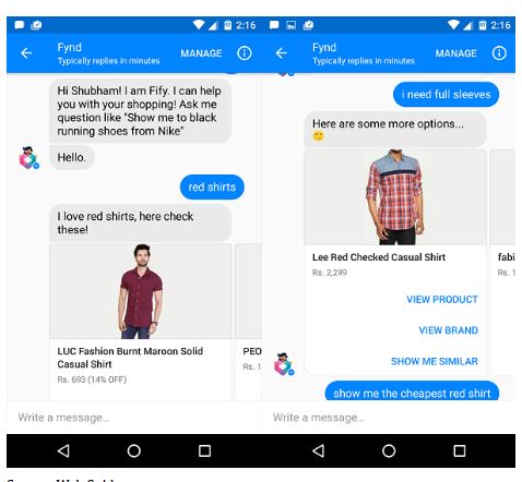
6. Provide phone/chat support
“44% of online customers say that having their questions answered by a live person during an online purchase is one of the most important features of an ecommerce website.” In case there is a problem during the checkout process, it needs to be addressed immediately, or else you may lose a customer. In this situation, sending an automated mail saying that it will be looked into in the next 48 hours may not help, especially if your competitors provide real time support. [caption id="attachment_9936" align="aligncenter" width="478"] Source: Web Spiders[/caption]
The checkout page is indeed the most important page of your ecommerce store. A very minor error or distraction can impact your business in a great way. That is why it is all the more important to identify every problem and keep your page optimized. To know more about how to improve user experience on your page, leave us a message and we’ll get back to you.
