May 10, 2019
6 Things to think of Before Creating a Logo for your Startup
To stay ahead of competitors, new and upcoming brands have to fight hard and plan their marketing tactics to target customers. A logo is often a company's first impression that impacts the brand perception, customer purchase decisions as well as an overall attitude towards a product.
A logo is a visual print on each product or service offered by the brand and therefore serves as the face and representative of the brand or business. A memorable logo design plays a major role in the branding of a business.
Below are some aspects of logo development which if followed, can turn a logo into a marketing tool:
"Since a logo is the brand's visual keystone — the most concise expression of its personality — an honest approach to defining its DNA is imperative to a successful result."- Harkins
 Source: http://mashable.com[/caption]
 Source: http://kineticgroupconsulting.com[/caption]
 Source: https://avalaunchmedia.com[/caption]
 Source: http://www.webyurt.com[/caption]
The logo should be a memorable work of art that can effectively convey the message of a brand. It should be unique, scalable and flexible so that it looks meaningful and decent on all online and offline platforms and fits in all sizes. If you want to know more about logo designing, leave us a message and we will get back to you!
Source: http://www.webyurt.com[/caption]
The logo should be a memorable work of art that can effectively convey the message of a brand. It should be unique, scalable and flexible so that it looks meaningful and decent on all online and offline platforms and fits in all sizes. If you want to know more about logo designing, leave us a message and we will get back to you!
1. Understanding the brand:
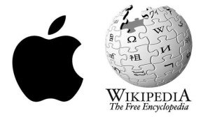
Thorough research should be done on the type of business, products, target customers and market niche before creating a logo. Once the relevant information is available, it is easier for the designer to pick the right elements for colours, shapes, fonts, lines and symbols for the logo. This is one way to create a logo and develop a brand identity. For example: In Apple, the fruit is missing a “byte” and in Wikipedia, the logo is an unfinished globe of a puzzle with glyphs from various writing system. Both the logos have a twist that goes back to the brand ideology. [caption id="attachment_11643" align="aligncenter" width="500"] Source: http://mashable.com[/caption]
2. Timelessness: Trends fade.
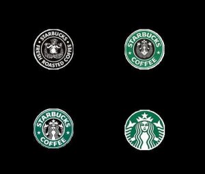
Trendy colours, patterns, typefaces and other design elements should be avoided since these tend to only last for few months/years. A classic and timeless logo is a wise choice to make as it will last for decades. If required, a few tweaks can be made to make the logo look fresh and new for future use. For example, Starbucks has modified its logo multiple times by modifying the mermaid and people still recognize that it as the Starbucks logo. [caption id="attachment_11644" align="aligncenter" width="500"] Source: http://kineticgroupconsulting.com[/caption]
3. Versatility:
The logo for a brand should be impressive both in colour and in black and white. The correct way to do this is to first design the logo without any colour. If the design looks good in black and white, then the designer can create the same logo with the brand colours. This way, the logo will appear outstanding in both colour and colourless versions. For example, Adidas incorporates a similar motif of three parallel lines or bars in all of its designs. The visual presentation might change depending on where the logo is printed, but it consists of the same elements.4. Scalability:
Logos appear on every small and big communication involved with a brand. Therefore a logo should be scalable i.e. it should not lose its sense of proportion, no matter where it is applied. When a logo is printed on a brochure, pamphlets, business cards, pens or billboards, the design elements of the logo should be clear, visible and understandable. The best way to maintain this is by using design grids.5. Choice of colours:
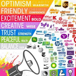
While designing a logo, the choice of a startup logo’s colour is of utmost importance as every colour is associated with specific emotions and feelings which will in turn be associated with the brand. For some, bright and bold colours will grab attention and for some, it may look brash. Muted tones exude sophistication but may be overlooked or ignored. Every colour has a different implication which may bring nuance to the message that has to be conveyed. A brand should choose its colours wisely. According to experts, it is best for brands to use as few colours as possible. This is because according to the reductionist method, it makes more sense as each individual colour gets the space to shine. Implications of some colours are as follows: [caption id="attachment_11646" align="aligncenter" width="500"] Source: https://avalaunchmedia.com[/caption]
6. Simple, quirky and minimalistic:
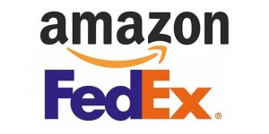
Brands should try to create something that is enjoyable and has a long-lasting positive impression on viewers. Avoid or remove all the extra design elements and keep only the necessary colours, shapes, lines, fonts and symbols that are needed to convey the message. A minimalistic approach will create a simple logo that consumers can easily relate to and instantly appreciate at a glance. For example, FedEx's logo is a simple Logotype with a twist. The image utilizes negative space to create an arrow which indicates precision, speed and direction. Along with it, the company changes the colour of the “Ex” in order to classify the type of shipping. Also, Amazon uses its name in its logo but also refers to its wide inventory with a small arrow pointing from a → z. [caption id="attachment_11647" align="aligncenter" width="500"] Source: http://www.webyurt.com[/caption]
The logo should be a memorable work of art that can effectively convey the message of a brand. It should be unique, scalable and flexible so that it looks meaningful and decent on all online and offline platforms and fits in all sizes. If you want to know more about logo designing, leave us a message and we will get back to you! Leave a Reply
Your email address will not be published. Required fields are marked *