July 07, 2020
A Comprehensive Guide to Website Design and Optimisation in 2020
“Websites promote you 24/7, no employee will do that.”
Most consumers search online for information that will help them make smarter purchasing decisions. In fact, according to the eCommerce Foundation, 88% of consumers will research product information before they make a purchase online or at a physical store. This buying behaviour trend emphasizes the importance of a website for today’s businesses.
97% of consumers search for brands and services online. A website helps a brand to build its credibility. Without a website, customers will keep wondering what the business or brand is about and eventually may opt-out or work with other brands whose intentions are clearer. Websites are one of the most important marketing tools that can serve and retain a brand’s current customers as well as be influential in finding new customers.
A brand without a website can lose out on important opportunities in business. However, just having a website does not mean the job is done. In a survey by HubSpot, 76% of the respondents indicated that the most important element for them while visiting a website is whether “the website makes it easy for me to find what I want.”
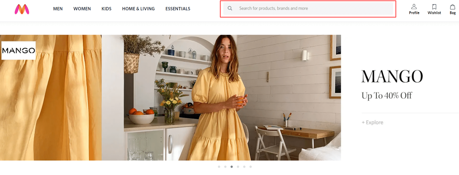
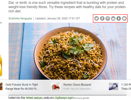
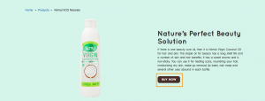
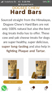
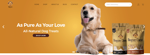
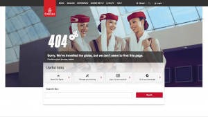 Image Source: Pinterest[/caption]
 In today’s age of instant gratification, the most successful websites are the ones that are quick, responsive and efficient. Design and software are now heavily based on user experience because it is mostly about the consumer in business. Even if users are simply browsing, it is up to the brand to make the users navigate through their website in the most efficient way possible so they can get the product or service they need.
It is essential for brands to keep a tab on their website and make improvements from time to time for better user experience. Keeping a record of the above important metrics will help in analysing where the website needs work and accordingly it can be designed. To know more about website design and optimisation, leave us a message and we’ll get back to you.
UI/UX DESIGN TIPS FOR OPTIMIZING A WEBSITE
UI (user interface) and UX (user experience) largely focus on customer satisfaction which is an important contributor to the success of any agency, organisation or business. Today the most successful websites and applications are those that boast of easy responsiveness and efficiency. Fast navigation features and ease of understanding drive more user satisfaction thereby leading to happy customers which help boost revenue in the long run. A proper website experience raises the confidence level of the customers in the brand which in turn helps in business growth. Following are some important UI/UX design tips for website optimization -Simplicity is key
When a visitor comes to a website, they are either looking for some specific information or to complete a particular action. Hence adding design elements which are unnecessary and serve no functional purpose makes it difficult to navigate a website. From the user’s perspective of experience and usability, a website should be simple. For instance, brand colours that are chosen for designing a website should go with the theme of the brand and should be part of the same colour palette. The typefaces that a brand opts for should be a maximum of 3 and in different sizes. Graphics should be incorporated into a website design only if it helps a user to complete their intention of visiting the website.Navigability and search bar
People visiting a website should be able to reach it easily and not have to think much about what to click next. Instinctual navigation on a website is extremely important to ensure that visitors can find what they are searching for. Hence, it is crucial to keep the primary navigation structure simple and easily understandable. Navigation on the footer of the page is helpful. Use of breadcrumbs on all the pages of the website along with the homepage is advisable as it will keep the visitors aware of their search trail. Add a “search” bar on the top portion of the page so that it is easy for people to look for products or services. Also, include links within the page copy and clearly show where those links lead to.
Social Media Share Buttons
The impact of content lessens if the visitors of a website do not have the freedom to share it. Social share buttons are small buttons that are clickable and placed at the top, bottom or at the sidebar of web pages. These buttons portray the icons of different social media sites like Facebook, Twitter, LinkedIn, Instagram etc. which allow a visitor to share a page of their choice directly on their social media channels. A website without these buttons tends to lose a large amount of traffic from social media that is generated from the visitors reading the content, blogs or performing any other action.
Call-to-actions
Call-to-Action buttons help or direct a user in taking the next step on the page. Brands should incorporate proper call-to-action buttons that lead visitors to content that educates them and assists them in solving their issues. Some useful call-to-actions are “click here”, “watch video”, “sign up for a webinar”, “buy now” etc.
Mobile-friendly
As per research, “80% of internet users own a smartphone and according to Google “61% of users are unlikely to return to a mobile site they had trouble accessing and 40% will visit a competitor’s site instead”. A website should be optimized for different devices like mobile phones, tablets as well as operating systems and web browsers to enable ease of use and to provide a better and improved user experience. Therefore, this indicates that the design of the website should be responsive and flexible. Brands can add alt-text to the images which will help visitors on the page understand the content even without being able to view the images. Cohere to platform-specific design conventions instead of stuffing in random elements that might not go well with the particular platform.
TIPS TO MAKE WEBSITE NAVIGATION EASIER
Establishing easy-to-follow directions through planned website navigation will help a brand’s customers explore their site effortlessly. Good website design and experience is not only about having useful and genuine information but also presenting it in an organized and appealing way. It is important to keep a tab on your website and make improvements from time to time for better user experience. Keep in mind the following tips to make website navigation easier for visitors -Use of clear and simple headings
“On average, 8 out of 10 people will read the headline, but only 2 out of 10 will read the rest.” The first thing that a user notices when they visit a brand’s page is the ‘heading’, so brands should be able to live up to the expectations and not afford to make mistakes in that. Brands should ensure that all their headings and subheads are clear and straightforward. It is also aesthetically better to keep all headings in the same length and parallel structure. Proper headings and subheads are also important for better SEO and website navigation. When the headings and subheads are crisp, clear, understandable and directly address the questions that the visitors come looking for to a brand’s website, it makes the site easier and more comfortable to navigate.
Addition of relevant images
Images are a great way to make a website look more appealing, interesting and attractive but only when they are relevant and chosen carefully. Using stock photos for a website is a big mistake in this regard committed by brands. Although it is easy and a cheaper option to use stock photos and may also look professional, it is often perceived to be impersonal, uninteresting and unrelatable by the audience. The human brain is known to identify images in almost 100 milliseconds. Therefore, selecting images that are an ideal reflection of a brand’s product or services can be a great opportunity to attract the audience even if they skip reading the content on the website.
Interactive website
An interactive website is most likely to make users browse your website for a longer period of time and encourage them to keep coming back. To make that possible, brands can make the text and images on the website interactive, engaging or may add some detailed textual information about a particular product or service. Other creative options for an interactive website include embedding polls and quizzes on the site.Interesting 404’s
If a visitor encounters a 404 error on a website, it can have a negative effect on that particular site which may drive users away. However, there might be unavoidable times when this issue can crop up, so the best thing a brand can do is be prepared for it. Brands should keep a thorough check on their website pages on a regular basis so that they are able to find the errors before their users find it. Apart from that, brands can also customize error pages to make it friendly, attractive or humorous instead of a general page. Another interesting way to keep the page audience entertained instead of annoyed is by integrating some kind of games in the 404 error pages. [caption id="attachment_14352" align="alignnone" width="651"] Image Source: Pinterest[/caption]
Choice of content
For a brand, if the content on their website is dull, monotonous, difficult to grasp or unnecessary, the audience is more likely to skip the page without reading anything. Style and tone are very important in writing, and so is the formatting and visual appeal. Brands should publish relevant, engaging and interesting content in short paragraphs, break it up into sub-heads and bullet points instead of long paragraphs.OFF-PAGE SEO STRATEGIES FOR WEBSITE OPTIMISATION
One very important technique which helps generate traffic to a website is search engine optimization. This can be done by obtaining a high-ranking placement on the first page of the Google search engine or other Search Engine Result Page (SERP) like Bing, Yahoo etc. A few well-known off-page SEO strategies for website optimization are -Guest blogging
Guest posting means posting an article that is written as a guest post by another website webmaster and is considered to be a popular link building method. There are plenty of such quality blogging sites where they allow authors to post articles as a guest. The author incorporates or inserts the links of another article in the guest post which creates a backlink to the author’s website. However, multiple postings on the same guest blogging site should be largely avoided.Image submission
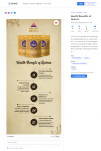
For better optimisation, brands should often share photos on popular image submission websites to increase visibility. These images should be optimized properly with the right URL and title tag. For visitors to understand the context easily, the images should also have a proper title, description and tags. Some popular image submission sites are Pinterest, visually, flickr.com, tumblr.com, imgur.com, picasa.google.com and mediafire.com.
Google My Business
Brands can utilise this free platform to optimize and gain the best local SEO ranking. It helps manage online presence across Google, including search and maps. Some of the basic things that should be followed while using this technique are:- Keep the description within 250 characters
- Make sure that there is one primary owner for every listing
- Keep a thorough tab on the reviews and be ready with quick replies
- Publish real images in the relevant category
- Update galleries, posts, products or offers on a regular basis
